You might not realise it, but microinteractions are all around us in the digital world. But what is a microinteraction? Microinteractions are basically small pieces of functionality that exist around larger features. They have become a key part of our digital life and go unnoticed as they are designed to be subtle.
Pulling down your Twitter feed for new updates, swiping to delete an email, double tapping to like an Instagram post – these are all examples of microinteractions. The fact is these little interactions can make a digital product more fun, easy, and effective.
“Good design is actually a lot harder to notice than poor design, in part because good designs fit our needs so well that the design is invisible, serving us without drawing attention to itself.” — Don Norman (American researcher, professor, and author)
A great example of a much used microinteraction is Facebook’s ‘like’ feature, which was expanded to include additional emotions: love, haha, wow, sad, and angry. When you’re scrolling through your feed, it is littered with faces under each post as users have become accustomed to this microinteraction.

A product can be centered around a microinteraction. Take Instagram, for example; without the pull-down to load new posts, double tap for liking and swipe to read direct messages, the app would have little functionality.
A microinteraction can be used for navigation and is a tool for further engaging your audience. It should be a short, sharp response that occurs when a user interacts with a digital product’s interface.

The structure of a microinteraction
There are four key parts of a microinteraction that Dan Saffer describes in his book ‘Microinteractions: Designing with Details’. They are triggers, rules, feedback, and loops and modes.

Trigger
This is when the interaction kick-starts; it is either initiated by the user or the system. The user-initiated trigger is what it says on the tin - the user initiates the action, which could be clicking or tapping a button or filling out a form. With a system trigger, software detects once a certain condition or set of conditions are met and then initiates the interaction. For example, when you receive a notification a bell icon shakes like it is ringing and a red badge is used to attract more attention.
Rules
These determine the action that happens once the microinteraction has been triggered. These guide the user through the interaction and should be seamless to ensure a natural flow from trigger, to rules and feedback.
Feedback
This lets the user know what’s happening. There are three types: audio, visual and haptic. Visual is the most common, as we look at what we interact with. Good examples of this are loading animations, a pop-up or colour filling an icon, along with many others. It is important to remember that you cannot rely on visual alone due to users with visual impairments or similar. It is vital that the products we design are accessible. A great example of this is the pull down to refresh action, on many the haptics are triggered once the refresh is complete and the device informs you that it has happened.
Loops and modes
This determines how long the microinteraction lasts. It will take into account whether the user will repeat it. The longer the loops, the longer the microinteraction that will help it to change and adapt. For example, microinteractions can be linked to a page loading, the microinteraction will loop several times until the loading is complete.
Why are microinteractions so successful?
Truly successful microinteractions need to be slightly noticeable before they disappear; they should be small and simple. The less effort a user needs to contribute to an interaction, the better the usability of the product. You will find that most interactions you see are seamless and require little effort. This can help create a better experience and turn a boring product into something fun by communicating information in an interesting way. This saves time and ensures maximum interactivity with the digital product. They should briefly capture users’ attention, then fade away to give your user a moment’s delight.
Microinteractions can also improve your users’ experience dramatically by preventing errors from happening in the first place. This ensures a seamless journey and enables the user to be in control.
Forms on websites and mobile are a great example of this. Quite often, sign-up areas will ask for a username and password. On submission, the user is notified that their username already exists, or their password does not meet the correct requirements, even though they were not specified previously. With inline validation, the user is saved extra work, they are notified on the fly whether their details meet the requirements.
Below are some examples of common microinteractions:
- Swipe action: this action eliminates tapping and helps the user navigate through the app or lists of data quickly

- Pull to refresh: this lets the user pull-down on content to retrieve more information. This is adopted on many apps, including Twitter, Instagram, and Facebook

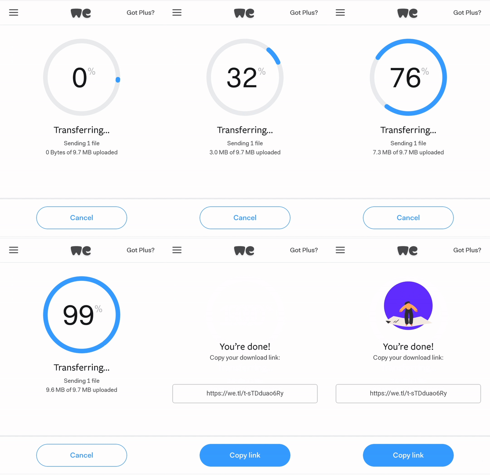
- Upload: this animation keeps the user informed on an action they have just carried out. It lets them know exactly what is happening and how much time is left in order to complete the action

So, to conclude:
With a microinteraction, you can be sure your design will go from zero to hero and make the users fully appreciate your product. By combining a trigger, rules, feedback, a loop, or a mode you will have a successful microinteraction. This will improve functionality, make your product more engaging, fun, and memorable.
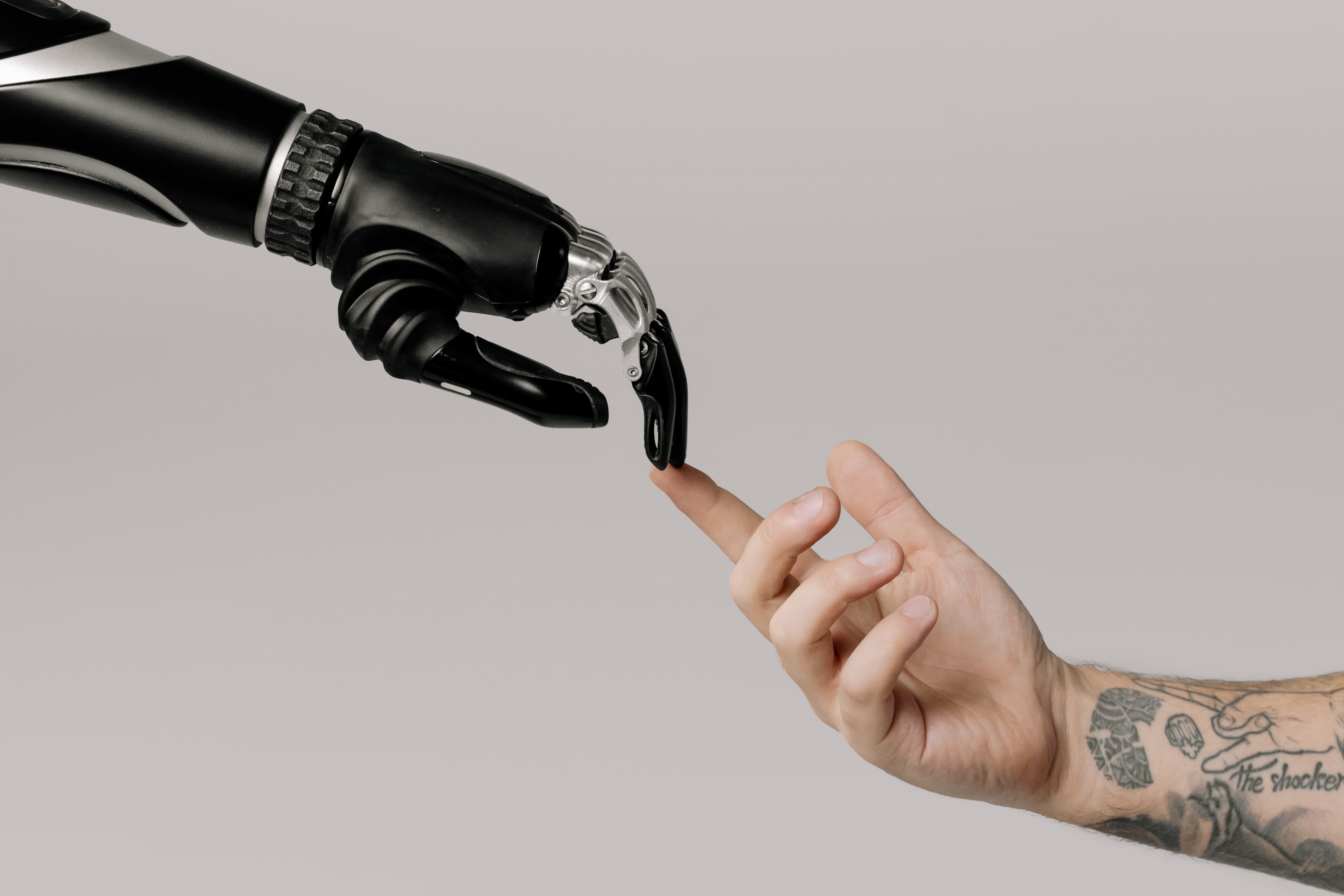
Being on the cusp of AI and self-driving cars, we need microinteractions more than ever to make design more humane. And, as stated by Dan Saffer:
'The difference between a product you love and a product you tolerate is often the microinteractions you have with it.'


