One thing we can all agree on – websites in the next 5 years will feel and operate in a completely different way to how they do today. No matter how large or small the change, everything about the world of web will show us the digital age truly has begun. So where do we start?
 Before we look ahead, let’s take a quick glance back at the past…
Where it all Started
It all began in 1991 with the launch of the very first website by the creator of the Internet himself, Sir Tim Berners-Lee. It provided information on how to create web pages and explained more about hypertext. The design? A few lines of Times New Roman text with some hyperlinks to other pages sitting on a plain white background – an online book perhaps?
Yes, websites may have been inevitably basic, but the digital flame had just been lit. Over the years, internet speeds improved, visual design trends started to evolve allowing form to work alongside function. In more recent years, the development of tech such as smartphones and tablets combined with the consumer’s ever-growing thirst for efficiency simply catalysed the growth of the website and the need for on-going transformation.
Now we know where we’ve been, let’s see where we could be going…
Artificial Intelligence
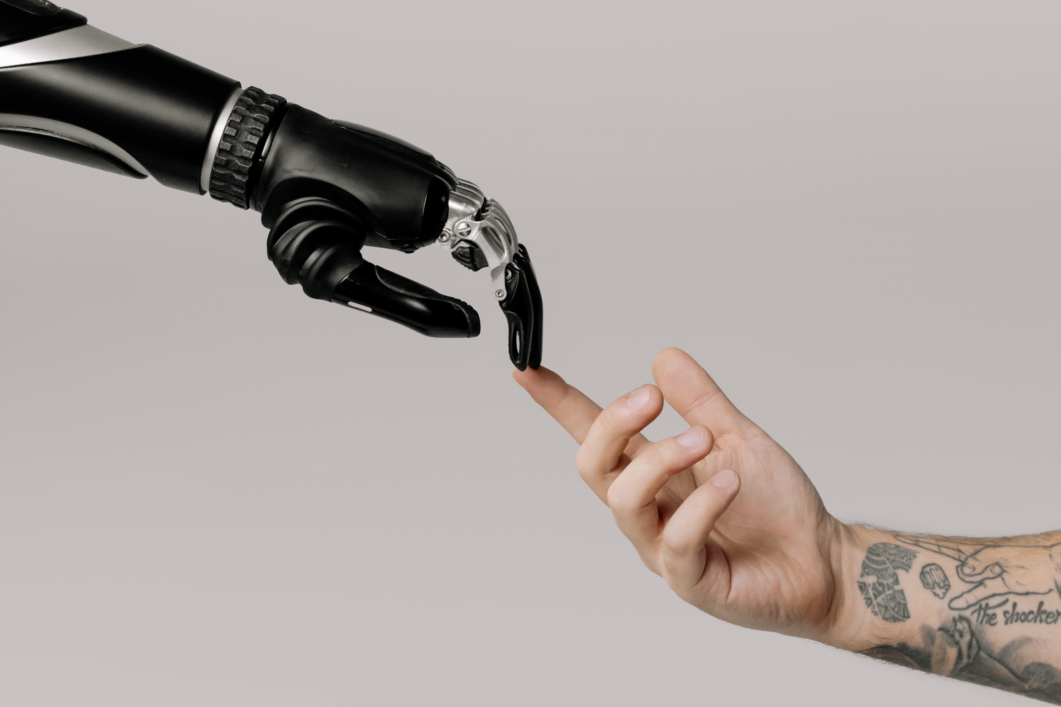
Artificial Intelligence (AI) is still quite a sensitive topic in the industry with discussions and concerns not just about if we can produce a machine-based platform to think for itself, but more crucially if we really should.
The question really is why do we need AI in our lives? Putting our Terminator worries to one side, AI is designed to make our lives easier. The perfect example – Chatbots; the chatbot service has already shown a positive reaction (in most cases) and businesses are using this feature more and more to engage their visitors. A study from G2 shows us AI-driven features like chatbots have a satisfaction rate of 73% as customers prefer to interact with businesses in this way. Another study from Chatbots Life has predicted 85% of consumer interaction will be handled without a human agent by 2020 and the reason why this figure of growth is realistic is simple – they can provide instant responses, 24-hour service and have minimal human error.
Over the next few years, AI features will start to stretch their legs with the main aim of improving the quality of instant support given to the everyday online consumer. We can therefore assume these machine learning algorithms will develop rapidly and components like online assistants, personal shoppers, smart sites, voice searching and many more will start to become more sophisticated and natural.
Smart and Truly Responsive
Gone will be the days of stacked design. With the handheld device taking the lead on global consumer usage, surely our web platforms will be following suit – we are in a stage of responsive design that puts mobile first, yet most do not honestly take this approach. Given this critical need for adaptability and with new creations like wearable tech, we can expect to see better flexibility for the smart-device viewing experience and possibly even the development of autonomy influencing the ability to create bespoke experiences tailored for individual users.
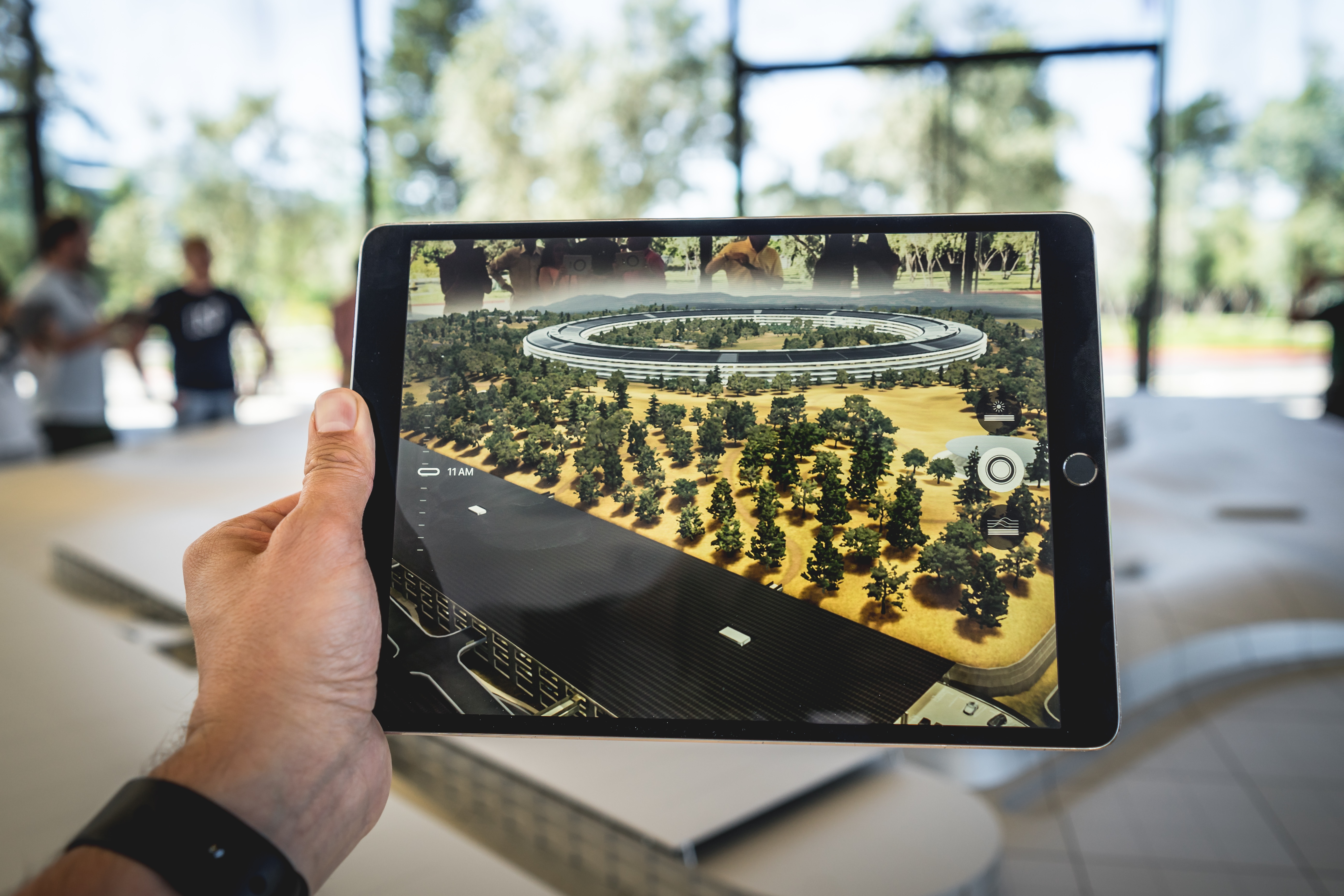
We are entering a culture that is living more and more through our screens, so how can we turn this into a positive? Microsoft has coined the term ‘mixed reality’ which brings to light industry enhancements like location-based tracking and the Augmented Reality market – predicted to be worth $160 billion (£132 billion) by 2023. The rise in such systems could change the way we use our websites in our daily lives – no longer may we be glued to our screens, what if instead as we walk by a high-street store we can receive a notification for the latest offers inside and without having to enter, be able to use AR to quickly check out the product on offer.
 Immersion
The ‘perfect website’ is made up of many things but could probably be summarised by the two simple acronyms: UI (User Interface) being the visual composition and UX (User Experience) being the way the website is designed to fit a user’s requirements.
For both of these fields, we will most likely see our websites bringing more depth, both visually and psychologically.
Deep-diving into visual design, we find ourselves looking at the wonderful world of gradients. Referred to as ‘Gradient 2.0’ in the Behance community, the effective use of gradients will see the subtle method of bringing depth and dimension to the interface rather than just to capture the attention of a user. Why is this topic of ‘depth’ so important? While this may just be seen by many as the visual satisfaction of a website, in actual fact, this will go hand-in-hand with the ‘mixed-reality’ aspect mentioned previously by making a website feel less like a 2D screen-based communication into something much more organic.
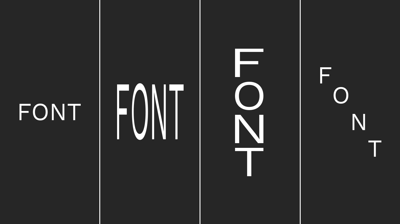
And that brings us nicely on to the topic of Typography, more specifically, the necessity for malleable typefaces increasingly known as ‘variable font’. Simply put, a variable font fits almost anywhere so you may understand how designers will appreciate being able to use these. When responsive design became the forefront of website design, fonts were one of the weak links in the chain as it meant on smaller devices like mobile the visual impact and overall fitting and alignment was easily lost however, a font that is adaptable for all screen sizes will allow for consistency to a brand – because in this day of digital awareness there would be nothing more obvious and careless than a desktop website that looks different to its responsive variants.
…and finally
So, let’s just recap quickly – Artificial Intelligence, Augmented Reality and living websites – surely this is the stuff of sci-fi movies.
 The evolution of the website is a very incremental process but one which sees a rapid influx of drastic developments. In essence, as we seem to be improving the digital landscape in alignment with the ever-changing user needs, we notice websites and interfaces actually become simpler and less taxing for a user and more focused towards integrating seamlessly into their lives.
Strangely, the theories about best practice for websites of the future brings us back round to the past, with that very first website that did exactly and only what it needed to, bringing to life Dieter Rams’ 10 principles of Good Design ultimately echoing the message that Good Design is… Simple.


