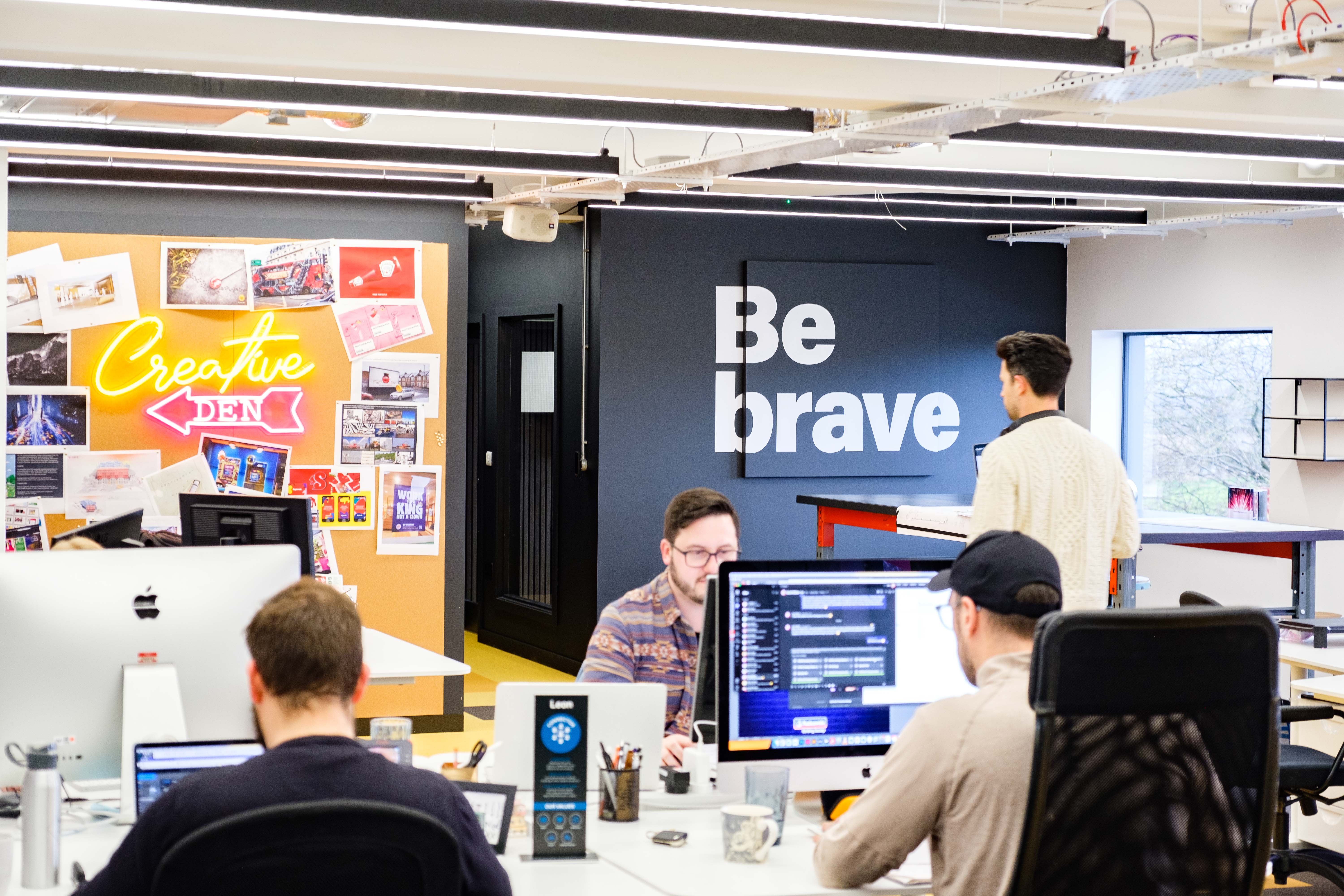
Design is everywhere. Though many think of design as the cherry on top of any project – the final finishes and flourishes, if you like – when you stop and look around, you’ll soon see design is integral to every object, every image, practically everything we interact with every single day. There’s no escaping design. And there’s no escaping the fact that, well, not all of it’s that great.
So, how do you make sure the design you’re putting out into the world is the best it can be?
Create clear boundaries
In its broadest sense, design touches everything around us. But in your day to day, and your role in comms and marketing, you’ll most likely be working with graphic designers. These highly skilled people focus on communication and sharing your key messages in a visual way. They might work on print projects, solely social, love typography or have a distinct visual style, but they all do what they do to illicit a response from your audience. When you and your graphic designers are in sync, you can get your audience to do (or not do) practically anything.
To get to that sweet spot, you need just one thing: an incredible brief. Graphic design works best within a set of rules, and to achieve the best for you, your designers have to play on the pitch you set out. If your definition of what you need, where your content is headed or who it’s aimed at is ill-defined, then you won’t see the results you hope for and you won’t get the best from your designer. It’s an easy fix, though.
Don’t be wooed by the ‘new'
Seeking out something new often seems like the best way to make a big impact on your audience. Particularly in fast-paced digital environments, it can feel like you’ll fall behind if you’re not pursuing a brand-new look at every opportunity. But it’s a mistake to seek out the new at the expense of tried-and-true wisdom. Graphic designers are more than just skilled hands; they possess a wealth of knowledge and experience just waiting to be tapped into.
While it's essential to communicate your instructions clearly and sometimes what you want and what you need will align, don't box yourself in by ignoring their valuable insights. Not every aesthetic works in every context, and big mistakes leave a big impact. Take, for instance, the infamous 2010 Gap logo change. Cheap, tacky, uninspiring; those are just a few words used to describe the updated logo on its release. The outcry was so strong, the brand reversed what’s been estimated at $100 million worth of work in about a week. The impact on the brand, though, lasted much longer.
For me, it just underscores the importance of heeding your graphic designer's advice, as their expertise can help you avoid costly missteps and maintain the integrity of your brand. Don't disregard their insights; your brand's success may depend on it.
/Bigtalk%20articles%202023/graphic%20designers%20discussing%20work%20over%20computer.jpg?width=5776&height=3851&name=graphic%20designers%20discussing%20work%20over%20computer.jpg) Let your designer be your problem-solver
Let your designer be your problem-solver
Instead of heading over to your graphic designer with preconceived solutions and overly detailed, restrictive instructions, give them the freedom to problem solve. A huge proportion of what your
designer does every day is solve problems through visual design. Yet many project leaders attempt to do that part of their jobs for them, and often end up with less effective outcomes as a result.
Think of it like this, when you hear a strange grumble on your drive to work, you’ll book your car in with a mechanic. So far, so good. When you arrive at their garage though, do you tell them what’s wrong, or take a wild guess and ask them to fix only a specific issue that you’ve identified with your own limited knowledge? If you take the second route, you’re unlikely to come away with a car that no longer grumbles, and your mechanic most definitely will. Trust the professionals to identify the issue and provide a fix and you’ll not only meet your objectives but create space to exceed them.
Don’t get hypnotised by complexity
What sets your brand apart? Sometimes, a small tweak can work wonders. While complexity certainly has its place and can be necessary from time to time, the true magic lies in simplicity. It's a common pitfall to overcomplicate projects, attempting to cram more content into every available inch. Paradoxically, this tends to weaken and dilute your message, rather than strengthen it. Great designers know this already but, as I’ve said, they can only work to the brief they’re given. Empower yours to distil your message to its most impactful core and make tough calls where they need to. Remember, blank space isn't just waiting to be filled; it has a purpose all of its own.
Ironically, it’s a writer that came up with one of the best lines on great design. As Antoine de Saint-Exupéry said, “A designer knows he has achieved perfection not when there is nothing left to add, but when there is nothing left to take away.” That’s the bedrock of exceptional design and just knowing it will help you partner with your graphic designer better. The best design is simple, but doing simple isn't easy.
Want to learn more about great design, or get one of our next-level graphic designers on your next project? Just reach out to anythingspossible@drpgroup.com.


